Sandbox
Here’s a place for some odds and ends that interest me. (Where does the term sandbox come from?)
Typography
I’ve had a lifelong interest in the way in which letters, numbers, and symbols are designed, long before I even knew what the word typography meant.
My Palmer Method cursive penmanship in grade school was always impeccable, much like my dad’s crisp handwriting. I loved making signs with stencils and carefully labeled my Maxell mix tapes using Letraset dry-transfer sheets purchased at a local stationery store. I even remember that my favorite styles back then were Old English Text and ITC Avant Garde, the latter of which seemed to appear everywhere in the mid-1980s.
Around the same time, I received a Sheaffer calligraphy set for Christmas. Before long, I became particularly skilled at Old English lettering and applied it to all sorts of school projects. To this day, I’m still quite good at calligraphy, and I’d really like to practice it more often.
The clarity of my cursive writing has gradually diminished, but I can still print extremely clear block letters in a distinctive style, and I’m planning to finally convert my handwritten style into a digital font, a creative goal I’ve had for a long time. I can also identify most popular typefaces by sight, a rather odd talent that I can’t quite explain; is there such a thing as a typographic memory?
Here are two of my favorites:
-
Bernhard Gothic Heavy (Lucian Bernhard, 1930; revival by Jim Spiece, 1993):

- A handsome (and sadly underappreciated) geometric style from the Art Deco era, and one that I’ve used on this site from its first launch in 2001. I particularly like the solid presence of its capital letters.
-
Adobe Garamond Pro (Robert Slimbach, 1989):

- I first noticed the classic forms of the Garamond family, specifically Garamond 3, when I was in grade school. Since then, I’ve grown so fond of this modern interpretation of Garamond that I selected it for our wedding save-the-dates, invitations, ceremony programs, and website!
In addition, I admire the reliable webfont service Typekit; the gorgeous information design work of Edward Tufte; the elegant, entrepreneurial calligraphy of Brooklyn-based Paperfinger; and not surprisingly, the 2007 documentary film Helvetica, directed by Gary Hustwit.
Dot-matrix Displays
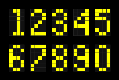
I have an eye for typography in some unusual places, including the dot-matrix displays from old electronic scoreboards (e.g., the Spectrum) and game shows (especially the flip-disc board on Family Feud in the late 1970s).
In fact, I’ve developed a microsite that displays your computer’s current time and date in these unique forms. Click the image below to check it out:

Cornerstones
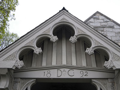
One of my most recent projects involves taking pictures of cornerstones on public buildings, churches, schools, and bridges.
This effort was motivated by my interest in two creative fields, architecture and lettering. I’m often curious about when buildings were originally constructed, and when I’m able to determine that information from a cornerstone, I admire the detailed craftsmanship that went into the engraving, often many decades before I was born.
Since I started this project in March 2011, I’ve taken several batches of cornerstone pictures, mostly in Philadelphia and its western suburbs. You can view the entire collection of 343 photos on Flickr here:

I’m looking forward to taking additional photos in the area soon!
